Using corner-shape Lets You Create Shapes That border-radius Could Not
corner-shapeis an experimental CSS property that changes the rounded corners ofborder-radiusto different profiles. Now you can create octagons, hexagons, triangles, and more by "just slightly angling the corners" while maintaining borders and shadows without usingclip-path.
First, a Mini Glossary
- border-radius: A property that rounds the corners of a box.
- clip-path: A feature that clips only the visible part of an element (like "cutting out" with a mask).
- mask: A feature that hides and reveals with a specific shape (like a stencil).
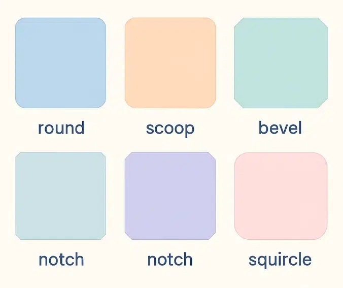
- corner-shape: Applies a different corner profile instead of roundness (e.g., bevel, notch, etc.).
- bevel: A corner "cut" at a straight diagonal.
- scoop: A concave corner "scooped" inward.
- notch: A groove-like shape where the corner is angularly "carved out".
- squircle: A smooth curve between a square and a circle (square + circle).
- aspect-ratio: The width:height ratio of an element.
Why corner-shape Instead of clip-path?
When you create polygons with clip-path, borders and box-shadows do not follow nicely, making management cumbersome. In contrast, corner-shape changes the shape of the corner itself, so borders and shadows naturally follow along, making it easier to maintain consistent design.
Quick Comparison
clip-path: Shapes are flexible, but border/shadow handling is hardercorner-shape: Only changes corners, cleaner code, borders/shadows OK
⚠️ Support Status: This is still experimental and currently only works experimentally in Chrome (with Flags), etc. When using in projects, please prepare a fallback strategy.
Basic Usage
.corner {
  border-radius: 30px; /* corner radius */
  corner-shape: round | scoop | bevel | notch | squircle;
}
round(default): The rounded corners we knowscoop: A concave scooped-out feelbevel: Slightly cut at a diagonalnotch: Angular groovesquircle: A smooth curve between square and circle
The Core Idea of Shape Drawing
The point is to use % with border-radius and combine it with corner-shape. This allows you to create various shapes with very little code.
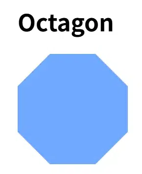
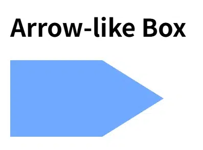
1) Octagon
.octagon {
    width: 150px;
    height: 150px;
    background: #70a9ff;
    border-radius: calc(100% / (2 + sqrt(2)));
    corner-shape: bevel;
    aspect-ratio: 1;
}
If the formula seems overwhelming, substituting about 29% works similarly.
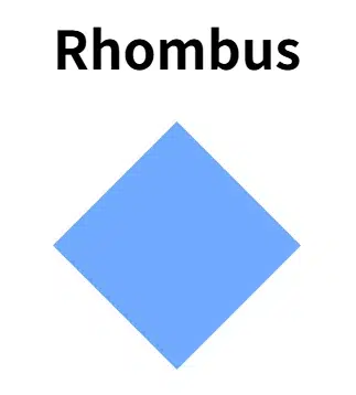
2) Rhombus (Diamond)
.rhombus {
    width: 150px;
    height: 150px;
    background: #70a9ff;
    border-radius: 50%;
    corner-shape: bevel;
    aspect-ratio: 1;
}
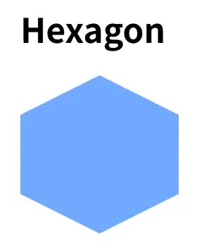
3) Hexagon
border-radius can have separate horizontal/vertical values divided by a slash(/).
.hexagon {
    width: 150px;
    height: 150px;
    background: #70a9ff;
    border-radius: 50% / 25%;
    corner-shape: bevel;
    aspect-ratio: cos(30deg); /* maintains proportions */
}
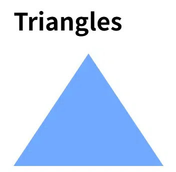
4) Triangles
By making some corners 0, you "kill" the corners to create a triangle.
.triangle {
    width: 200px;
    height: 150px;
    background: #70a9ff;
    border-radius: 50% / 100% 100% 0 ;
    corner-shape: bevel;
}
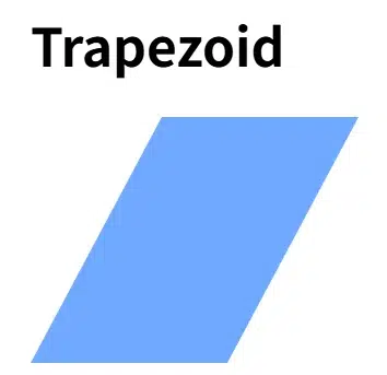
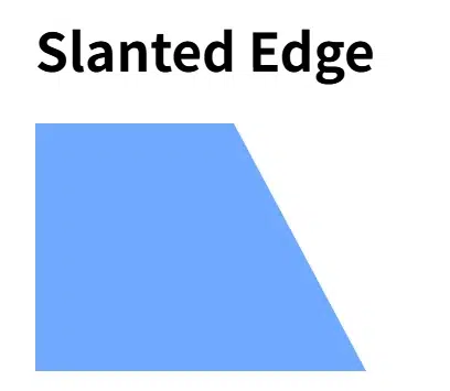
7) Trapezoid
.trapezoid {
    width: 200px;
    height: 150px;
    background: #70a9ff;
    border-radius: 80px / 100% 0 100% 0;
    corner-shape: bevel;
}
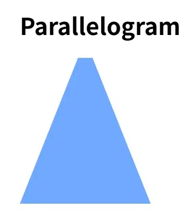
8) Parallelogram
 .parallelogram {
    width: 180px;
    height: 200px;
    background: #70a9ff;
    border-radius: 80px / 100% 100% 0 0;
    corner-shape: bevel;
 }
Cleaner Code, Better Maintainability
- Simplified Syntax: Easier to write/modify than
clip-pathpolygons. - Borders & Shadows OK: Decorations naturally follow the corners.
- Responsive Shapes: Look good even with size changes using % based radii.
- Mix Corners: Different profiles possible for each corner.
.mix {
  border-radius: 48px;
  /* Order: top-left, top-right, bottom-right, bottom-left */
  corner-shape: bevel round notch scoop;
}


