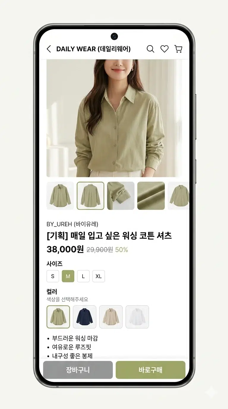
You know those little color squares below product images when you're browsing clothes on Coupang or Musinsa? Red, blue, beige... that kind of thing. For a while I thought designers were making those one by one in Photoshop. And actually, some places really did it that way. India's largest e-commerce platform Flipkart did exactly that. By hand. With 4,000 product photos coming in every single day.
Recently, while digging around about image processing, I stumbled upon a post on Flipkart's engineering blog about this exact topic, and it was pretty interesting. They solved the problem by cleverly combining data they already had, without using any fancy deep learning. The post is from 2014 so the tech itself is dated, but the approach was impressive enough that I decided to write it up.
Color Palette Images: Simple But Surprisingly Important
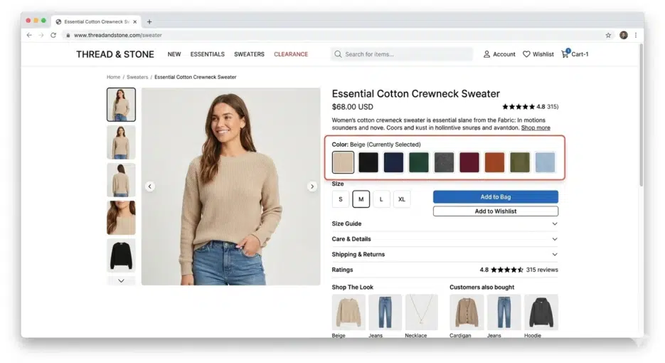
Palette images sound fancy, but they're really nothing special. They're just small square images representing a product's colors. Instead of writing "this shirt also comes in red," you show the color visually.
Why is this needed? Because color names are genuinely confusing. Who immediately knows what color "fuchsia" is? I had to look it up and it turned out to be a shade of purple. When you can just show a colored square and someone understands in 0.1 seconds, there's no reason to use text. A totally rational UX decision.
Flipkart's Manual Era
Flipkart originally did all of this by hand. When a product image appeared in the admin console, a staff member would drag-select a tiny area where the color was clearly visible. The coordinates and product ID would go into a queue, and a queue consumer would crop that area to create the palette image.
2,500 new product shoots per day, roughly 4,000 images. Add in marketplace seller products and it was an unmanageable volume. Fashion products are seasonal, so there are periods when volume suddenly spikes, and planning workforce allocation for those times must have been a headache. That's what pushed them toward automation.
Automation Struggles: Failed Approaches
This is where it gets interesting.
How About Color Quantization?
The first thing they tried was color quantization, extracting dominant colors from the entire image. Reduce the image's millions of colors down to 16 or 8, and use the most frequent ones as the palette. With ImageMagick you'd just run convert image.jpeg -colors 16 -depth 8 and you're done.
But the results were terrible. Product photo backgrounds are usually white, so naturally white dominated as the #1 color. What's the point of having a white square in your palette?
Remove the Background First?
So what if you remove the background first? That didn't work either. Even with the background gone, the model is still there. The model's skin tone, hair color, and the other clothes the model is wearing all get mixed in.
Consider the case where a scarf is the product. The photo contains the background, the model's hair, skin, earrings, t-shirt, jeans, and bracelet. You need to isolate just the scarf from all of that, and in 2014, doing this with image processing alone was practically impossible.

Nowadays with things like SAM (Segment Anything Model), product segmentation has become much easier, but 10 years ago it was a really tough problem. When I first tried SAM, I spent over 20 minutes testing random things while going "this actually works??" That's how impressive it was.
A Shift in Thinking: Finding the Answer Outside the Image
The Flipkart team's ultimate conclusion was "this isn't a problem you can solve with image processing alone."
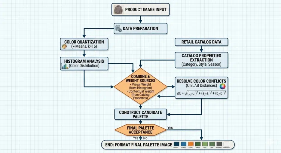
Here's the key idea. Flipkart's catalog system already had color attributes stored for every product. When you register a shirt, color information like "red+blue" gets entered. The insight was to combine this metadata with image analysis.
However, you can't just use the color attribute values directly for the palette. "Red" doesn't mean the same red every time. Wine red is red, cherry red is red, and coral could arguably be red too. You need to find that specific shade of red that's actually in the product photo for it to be meaningful.
The Actual Process
Here's roughly how it worked.
First, apply color quantization to the product image to reduce it to about 16 colors. Then run a histogram to extract the RGB values of the top 8-10 most frequent colors. Simultaneously, fetch the product's color attributes from the catalog API (e.g., grey, pink). Convert these attributes to RGB (grey → #808080, pink → #FFC0CB), calculate the "distance" between the top colors and the attribute colors, and select the closest match. Finally, combine the selected colors to create the palette image.
Histogram extraction with ImageMagick looks like this:
convert quantized.jpeg -colors 16 -depth 8 -format "%c" histogram:info: | sort -nr | head -n8
They reportedly combined im4java for image processing with the Catalano framework (a scientific computing library for Java) for color distance calculations.
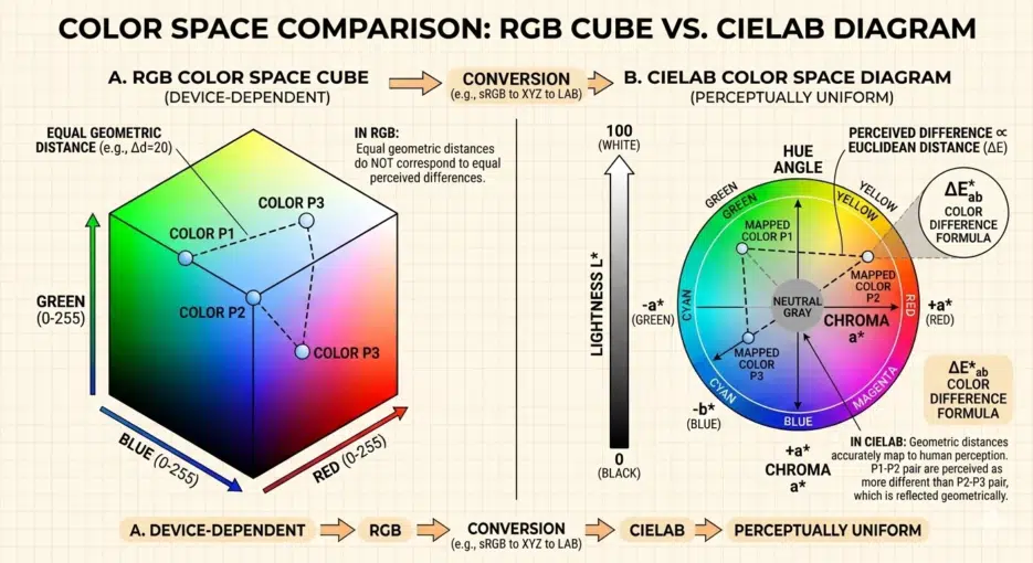
Why You Shouldn't Compare Colors in RGB
I need to get into some color theory here, because understanding this part is what makes the use of CIELAB make sense.
Intuitively, it seems like you could measure how similar two colors are using Euclidean distance in RGB. Square the differences in R, G, B, add them up, take the square root, and you're done. But the problem is that mathematical distance in RGB space doesn't match how the human eye perceives color differences.
Honestly, CIELAB isn't perfect either. It was later discovered that perceptual uniformity breaks down in highly saturated regions, which is why improved formulas like CIE94 and CIEDE2000 came out sequentially. CIEDE2000 is the current industry standard, but the calculation is much more complex. For an e-commerce palette use case in 2014 though, CIE76 level accuracy was probably sufficient.
Results: Surprisingly Usable
There were several advantages.
Speed was on a completely different level. Comparing it to manual work was meaningless. Even with 500,000 new products per day, processing happened instantly with no queue, unaffected by seasonal fluctuations.
File size reduction. Manually cropped palettes included color gradients and were larger (averaging 529 bytes), while auto-generated palettes were solid colors with better compression efficiency, around 301 bytes. That's roughly a 43% reduction. When you're dealing with millions of images, this difference is not negligible.
Guaranteed 1:1 aspect ratio. Manual crops varied in proportion depending on who did them, but auto-generated ones were always perfect squares, maintaining consistency across the entire site.
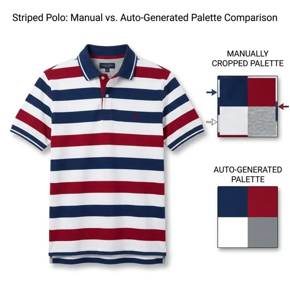
Results were reportedly especially good for products with fine patterns spread throughout or multi-color products. Making a palette for a striped polo shirt manually requires precisely targeting the intersection point where colors overlap, which is harder than you'd think. For a polo shirt where the top third is white, the palette could look completely different depending on where you crop.
Limitations: Honestly, There Were Weak Spots
The biggest weakness of this approach is that it's completely dependent on catalog data quality. If the color attributes stored in the backend are wrong, the palette will obviously be wrong too. If a seller registered something as "navy" but it's actually closer to black? The palette will pick the wrong color.
The color name → RGB mapping is also a surprisingly tedious task. Colors like peacock, navy, and skin need to be manually defined, and attributes like "multicolor" can't be converted to RGB at all, so they need exception handling. It's supposedly a one-time thing, but I imagine there were quite a few edge cases.
Also, this is just my thought, but you know those seller-taken photos shot under yellowish lighting? In those cases, colors will inevitably be distorted during the quantization stage, so no matter how accurately you calculate the CIELAB distance, the results will be off. This must have been an issue in practice.