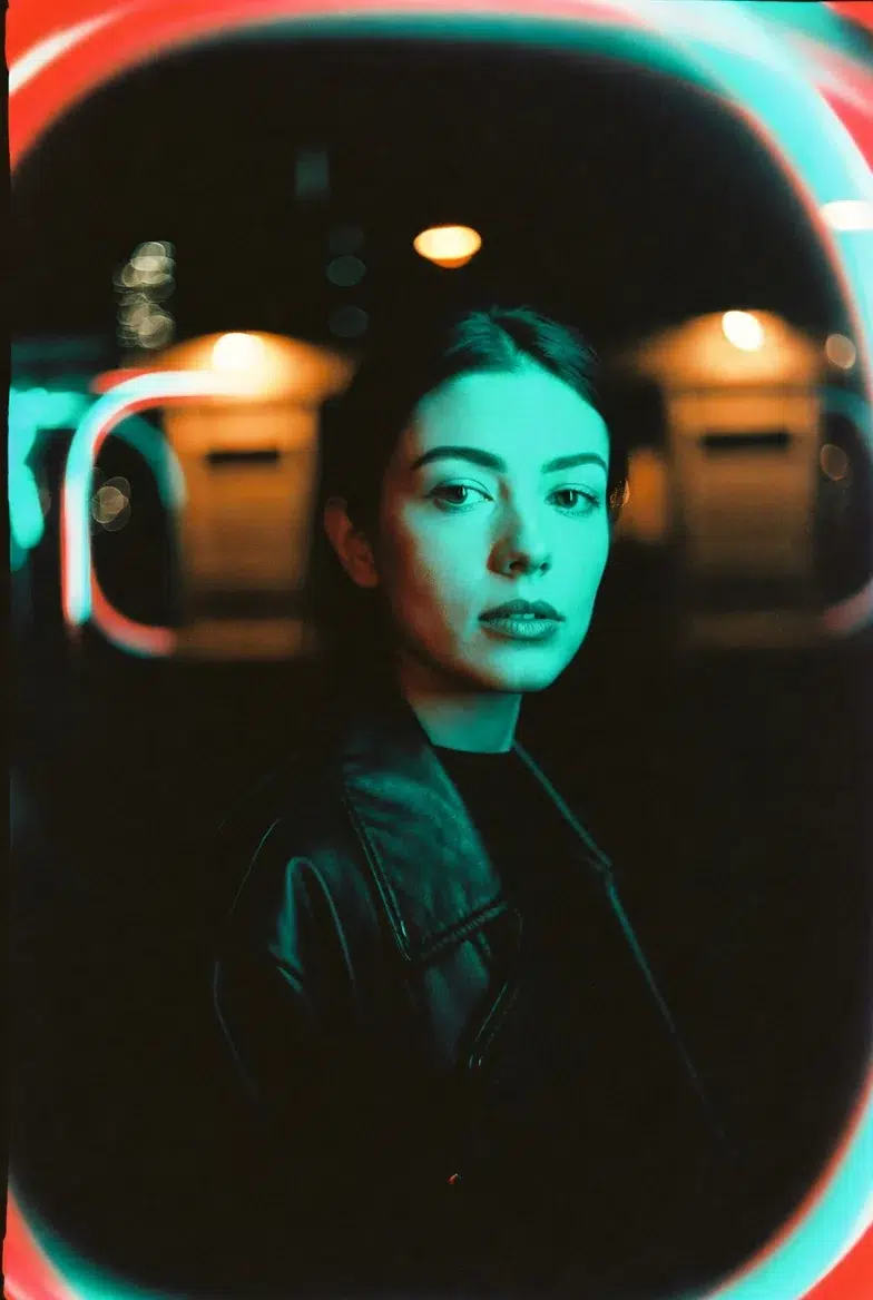
Someone I know received a portrait photography commission last month, and the client said, "I want it to look like Cinestill 800T." The problem was that the photographer had never used Cinestill 800T before. Buying a roll of film and testing it would cost at least 30,000 won including development fees, and if you don't like the results? That's just money down the drain.
That's when they wrote a prompt in Grok Imagine for the combination "Cinestill 800T + neon lighting + leather jacket," and within 35 minutes, the lighting setup and color direction were practically nailed down. The biggest win was being able to show the client a reference before the actual shoot, saying "This is roughly the mood we're going for."
The core idea is simple: use AI image generation not as the final deliverable, but as a "previsualization engine." It's not about faking your portfolio — it's about using it as a tool to test lighting, color, and mood before the actual shoot. And it turned out to be way more practical than you'd expect.
Why Photographers Need to Know About AI Image Generation
Honestly, even while writing this, there was a part of me that felt a bit uneasy. The debate over "Can AI-generated images be called photography?" has been ongoing since 2024 and continues to this day. But Carolina's perspective sidesteps that debate entirely. Just use AI images as a "sketchbook" rather than a "final deliverable."
Specifically, here's what you can do:
You can test lighting before scouting a location, check whether a specific lens's signature bokeh works for a particular scene before renting expensive equipment, and show clients a precise reference saying "This is the vibe." Sure, you could make a mood board on Pinterest, but showing "exactly the combination I want" is much faster when you craft the prompt yourself and generate it.
Key Elements for Adding "Photographic Realism" to Prompts
This is where the real substance begins. These are the prompt components organized by Carolina, and anyone who knows photography will immediately get it.
Film stock and grain. When you include specific film names in your prompt, the color rendering, contrast, and grain structure change dramatically. Kodak Portra 400 gives you warm, forgiving skin tones with fine grain; Ilford HP5 pushed to 1600 delivers crushed blacks with harsh grain; Cinestill 800T creates a cinematic nighttime feel with strong halation around light sources.
Lens characteristics. The creamy bokeh of a Canon EF 85mm f/1.2L, the swirly bokeh of a Helios 44-2, the horizontal flare of anamorphic lenses. Including these in your prompt, and Grok reflects them surprisingly well.
Lighting setup. Using specific lighting pattern names like "Rembrandt lighting" or "butterfly lighting" produces much better results than vaguely saying "dramatic lighting."
Camera format. The natural perspective of 35mm full frame, the compressed feel of 6×7 medium format, the extremely sharp texture of 4×5 large format. Specifying the format changes the overall "weight" of the image.
Practical Prompts — Tested and Curated
The original reference article has 10 prompts, but covering all of them would take forever, so I've curated the ones that produced the best results when I actually tested them in Grok Imagine. Note that I've also corrected a few errors from the original.
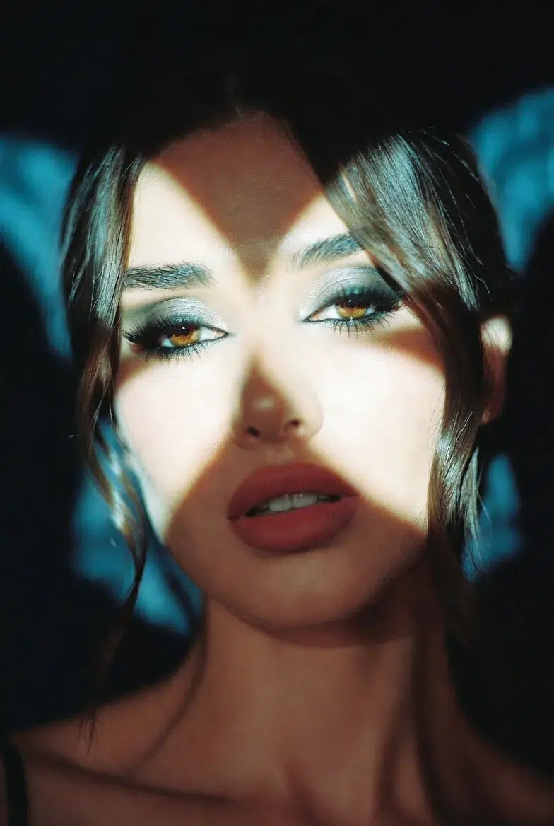
Cinematic Night Portrait — Cinestill 800T + Helios 44-2
This was the most impressive one. The combination of halation and swirly bokeh created an atmosphere that truly felt like being on a "nighttime film shoot set."
moody environmental portrait of a woman in a leather jacket under neon lights at night, contemplative expression, rim light plus practical neon sources, shot on Cinestill 800T 35mm film, Helios 44-2 58mm f/2 lens wide open, strong red halation glow around highlights, swirly bokeh, vintage glow and swirl in background lights, cinematic teal-orange tones, noticeable film grain, dramatic mood
The signature red halation of Cinestill 800T came through quite well in Grok. However, teal-orange tones is a Hollywood color grading cliché, so it might be hit or miss depending on taste. Personally, I tried replacing "teal-orange" with "cool shadow with warm highlight," which produced a more natural result.
High-Contrast Noir — Ilford HP5 Plus 400 (push +2) + Leica 50mm
The quintessential black-and-white street photo feel.
raw black and white street portrait of a woman with short hair and intense gaze, urban alley background, harsh side lighting with deep shadows, shot on Ilford HP5 Plus 400 pushed to 1600, Leica APO-Summicron-M 50mm f/2, clinical sharpness and micro-contrast, crushed blacks, pronounced gritty film grain, classic street photography aesthetic, high drama
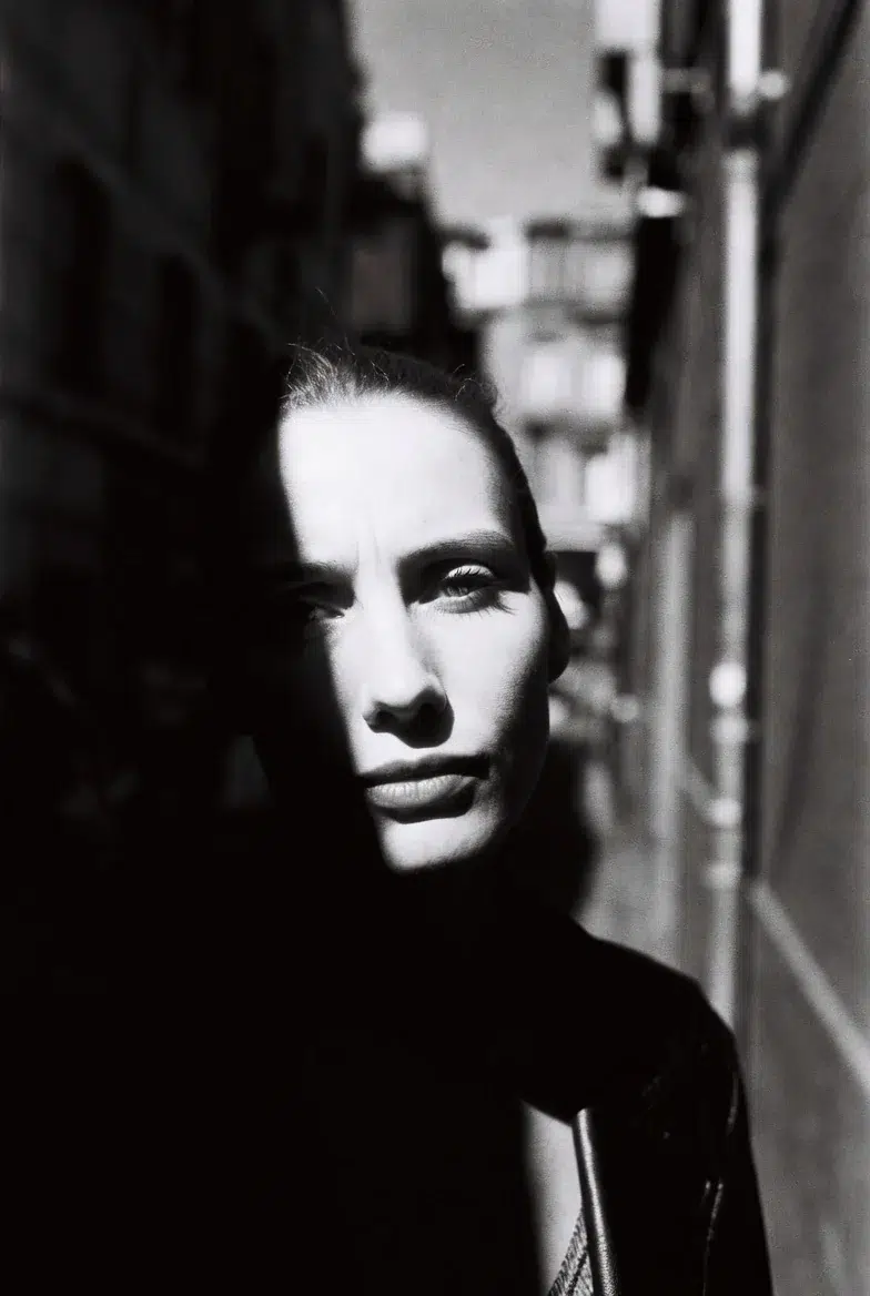
Writing pushed to 1600 makes Grok push the grain up quite aggressively. The rough feel of an actual HP5 push +2 is decently reproduced, but honestly, the characteristic highlight blowout of a "real HP5 push" is a bit weak. AI tends to try to preserve highlights. You need to explicitly add blown-out highlights to the prompt for better results in this regard.
Soft Window Natural Light — Fujifilm Pro 400H + Canon RF 50mm f/1.2L
This prompt produced the most beautiful colors.
soft natural-light portrait of a young woman with freckles, slight head tilt, golden-hour window light, minimalist white wall, shot on Fujifilm Pro 400H 35mm film, Canon RF 50mm f/1.2L at f/1.4, velvety smooth skin rendering, muted natural colors, creamy dreamy bokeh, delicate halation, very shallow depth, contemporary portrait aesthetic
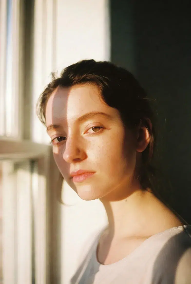
For reference, Fujifilm Pro 400H was discontinued in 2021. Production was halted due to raw material supply issues, and while there were rumors of a re-release in 2025, Fujifilm ultimately clarified it was an error. So it's a film you can't actually get anymore, but there's no problem simulating "that look" in AI prompts. In fact, this is one of the advantages of AI previsualization — you can test the color rendering of discontinued or hard-to-find films at no cost.
Cross-Processing — Expired Ektachrome E100 + Meyer-Optik Primoplan 58mm
This is the most experimental prompt, and the results are somewhat inconsistent.
surreal color portrait of a model with ethereal makeup, dreamy expression, soft diffused light plus subtle rim, shot on expired Kodak Ektachrome E100 cross-processed in C-41, Meyer-Optik Gorlitz Primoplan 58mm f/1.9, swirling bokeh bubbles, strong color shifts with cyan shadows and warm skin, vintage glow and aberrations, experimental fine-art mood, noticeable grain
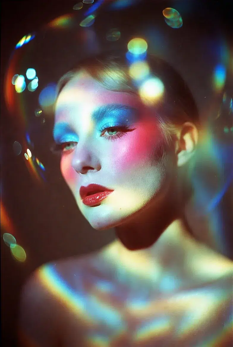
cross-processed in C-41 means developing slide film in standard negative developer, which completely distorts the colors. Cyan shadows with warm skin tones, unpredictable color shifts. How well does Grok capture this "unpredictable" feel? Well, about 70%? The color shifts come through well, but it doesn't quite achieve the "accidental" beauty of real cross-processing. AI tends to want to make things "pretty" in the end.
The soap-bubble bokeh of the Meyer-Optik Primoplan was surprisingly well reproduced. It creates a different round bokeh pattern compared to the swirly bokeh of the Helios, and I was somewhat surprised that Grok could distinguish between the two.
Workflow: AI → Analysis → Actual Shoot → Post-Processing
Let me outline the practical loop.
Step 1. Write detailed prompts matching the shoot concept and generate 4-8 variations.
Step 2. Analyze the results. Examine where the key light is coming from, how the grain interacts with the skin, and how the bokeh shape affects the mood.
Step 3. Translate to an actual shoot. Set up a similar lighting diagram, rent or select alternative equipment, and do test shots.
Step 4. In post-processing, reference the AI images' color/grain feel to adjust curves, apply grain overlays, and split toning.
Step 5. If something feels off, go back to AI and refine the prompt. Things like "make the halation more subtle" or "lower the shadow contrast."
The reason this loop works well is that it dramatically reduces trial-and-error time. In an era where a single roll of film costs over 10,000 won, the approach of "just shoot and develop to see" is becoming increasingly unrealistic. Of course, it can't completely replace actual shooting experience, but for establishing a "general direction," it's undeniably efficient.
Honest Limitations and Caveats
While this workflow is quite useful, there are some definite limitations.